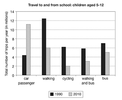
The chart below shows the number of trips made by children in one country in 1990 and 2010 to travel to and from school using different modes of transport. Summarize the information by selecting and reporting the main features, and make comparisons where relevant.
The given bar chart depicts information regarding the round travelling done by the pupils via different modes for academic classes in a nation in 1990 and 2010.
Using car primary students commuted 4 million times to school which counted at 11million approximately after 2 decades. In 1990, pedestrian journeys to and from the academy were almost 12 million whose figures went down to its half and noticed at 6 million in 2010. Bicycle users were over 6millions which levelled down to its one-third over twenty years.
Only little changes were seen in the sum of trips done by bus. Before it was at 7 million after twenty years usage of bus decreased by 2 million. In the former year, there were up to 6 million pupils who preferred both pedestrians as well as a bus then dipped to 3 million, eventually.
Overall, it can be seen that before students used those modes required physical strengths but the bus also. Whereas, over 2 decades four-wheelers were more prioritized than others.

Comments
Post a Comment